Page 254 - SpringBoard_ELA_Grade7_Flipbook
P. 254
aCTIvITy 3.19
continued
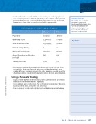
5. Use the information from the table below to create your own bar graph or pie chart comparing the lives of blacks and whites in South Africa under apartheid. You may draw your chart, or use technology if you have access to a computer. Remember to place a title on your chart and label it appropriately.
A 1978 Snapshot of South Africa Under Apartheid
Blacks
Whites
Population
19 million
4.5 million
Ownership of Land
13 percent
87 percent
Share of National Income
< 20 percent
75 percent
Ratio of Average Earnings
1
14
Minimum Taxable Income
360 rands
750 rands
Annual Expenditure on Education per Pupil
$45
$696
Teacher/Pupil Ratio
1/60
1/22
my Notes
6. Present your completed bar graph or pie chart to a classmate. As part of your presentation, show your classmate where you got the information in your graphic. After your classmate presents his or her graphic to you, talk about the advantages and the limitations of bar graphs and pie charts in presenting data.
Setting a Purpose for reading
• As you read the timeline on the following pages, underline words and phrases that tell you how the information is organized.
• Circle unknown words and phrases. Try to determine the meaning of the words by using context clues, word parts, or a dictionary.
• Place a star next to dates and statistics that you think are important to know.
Unit 3 • Choices and Consequences 227
TeCHNoLoGy TIp
If possible, use a computer program to create your timeline and add visuals. Also, experiment with an online document-sharing program
to collaborate with group members on this project.
© 2017 College Board. All rights reserved.